Three Copyable Design Rationale Examples for Designers, Students, and Teams
Three Copyable Design Rationale Examples for Designers, Students, and Teams
Design rationale is the recorded reasoning behind a design decision: the question it answers, the alternatives you rejected, and the evidence that tipped the choice. This article gives you three worked examples at different fidelity levels, a copyable template with the fields reviewers actually look for, and specific guidance on when to write it down before the reasoning evaporates. It’s built for designers, students, and project teams who need to defend decisions later, not just make them now.
TL;DR:
- Document design rationale close to the decision point to preserve the reasoning and avoid forgetting key alternatives or evidence.
- Use a simple, structured template that captures issue, decision, alternatives, criteria, evidence, stakeholders, date, and links for each decision.
- Lead with the decision in your rationale to make it immediately clear, and connect it to measurable criteria and evidence for clarity.
- Integrate capture into existing workflows like wireframing and testing to reduce effort and increase consistency over time.
- Start with a small, focused template for one project or sprint to build habit before expanding to more formal systems or tools.
Table of Contents
- What Is Design Rationale, Really?
- Why Bother Documenting Design Decisions?
- A Copyable Design Rationale Template
- When to Capture Rationale During Design Work
- Three Worked Design Rationale Examples
- How to Write a Design Rationale That Holds Up in Review
- Making Rationale Capture Stick, Not Just Exist
- Why Most Teams Get Rationale Capture Backward
- Try The Intent Ledger for Structured Design Rationale
- Sources
What Is Design Rationale, Really?
Design rationale is not a spec, and it’s not a decision log. A spec tells you what to build. A decision log tells you what was decided and when. Rationale answers the harder question: why this and not something else? It captures the reasons behind a choice, including the alternatives considered and the trade-offs that ruled them out, according to the standard definition of design rationale.
Think of a design artifact as an answer to a question someone asked, whether that’s a stakeholder, a user, or your future self six months from now. That reframing matters: a button placement stops being “a preference” and becomes “the answer to how do we reduce mis-taps on mobile checkout.” That shift from opinion to traceable argument is what makes rationale defensible in a design review instead of just personal taste dressed up as expertise.
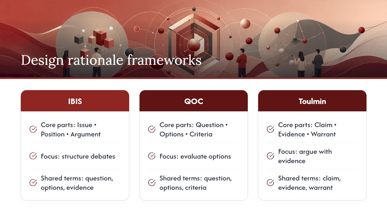
Two frameworks anchor most serious rationale work. IBIS (Issue-Based Information System) structures reasoning as issues, positions, and arguments. QOC (Questions, Options, Criteria) does something similar but leans harder on explicit evaluation criteria. Toulmin’s argumentation model, older and more general, breaks an argument into claim, evidence, and warrant. You don’t need to adopt any of these wholesale. Borrowing their vocabulary, question, options, criteria, evidence, is usually enough to turn a vague justification into something a teammate can actually evaluate, and survey work on design rationale systems backs this lighter-touch approach over rigid formal capture.
Why Bother Documenting Design Decisions?
The honest case for design rationale documentation is mundane and that’s exactly why it holds up. New team members stop asking “why is it built this way?” in every standup. Design reviews shift from re-litigating old choices to evaluating new ones. When a feature breaks six months later, whoever inherits it can see the constraints that shaped it instead of guessing.
The benefits cluster around a few recurring wins:
- Communication: stakeholders and new hires get context without a meeting.
- Verification: reviewers can check a decision against its stated criteria instead of arguing from scratch.
- Maintenance: engineers modifying old work know what NOT to break.
- Reuse: similar problems on future projects get a starting argument, not a blank page.
- Onboarding: junior designers learn the “why” behind conventions, not just the conventions.
None of this is controversial. The gap is between believing it and doing it. Practitioner surveys on architecture design rationale consistently find that professionals value documenting rationale but rarely do it consistently, citing barriers around lack of methodology and tooling as the main obstacles. A related survey of architecture design rationale use found the same pattern: designers reason about choices constantly but lack a standardized way to capture that reasoning before it disappears.
The fix isn’t more process. It’s less. Capture cost has to stay below the value it produces, or nobody keeps doing it past week two.
A Copyable Design Rationale Template
Here’s the part you can steal outright. Every solid rationale entry, regardless of fidelity level, answers the same core questions. The granularity changes; the fields don’t.
The essential fields:
- Issue or question: what problem or decision point triggered this?
- Decision: what did you choose?
- Alternatives considered: what else was on the table, and why did it lose?
- Criteria: what standard did you judge the options against (usability, technical constraint, business goal, accessibility)?
- Evidence: what backs the decision (user interview, heuristic, analytics, prior incident)?
- Stakeholders: who weighed in or needs to know?
- Date: when was this decided (rationale ages, and dates let you spot stale reasoning)?
- Links: where’s the artifact, ticket, or transcript this ties back to?
You don’t need all eight fields filled out for every micro-decision. A quick flow choice might get three fields in one sentence. A contested pricing-page layout might get a paragraph for each. Match the depth of the entry to the size of the decision, not to the template.
Here’s what a filled-in line looks like in practice:
Issue: Should the checkout form use one page or three steps? Decision: three steps. Alternatives: single long-form page. Criteria: completion rate, cognitive load on mobile. Evidence: five of seven usability test participants abandoned the single-page version at the payment field. Stakeholders: PM, lead engineer. Date: March 3, 2026. Links: usability test recording, ticket #482.
That’s roughly forty seconds of typing that saves someone a re-argument in Q3.
For teams that want field-level detail baked into a reusable format, a design documentation template built around these fields tends to outperform ad hoc notes, mostly because it removes the “what do I even write” hesitation that kills documentation habits.
Pro Tip: Write the issue as a question, not a statement. “Should navigation be a sidebar or a top bar?” forces you to actually name the alternative, where “navigation decision” invites you to skip it.
When to Capture Rationale During Design Work
Rationale dies when you wait to write it down. The reasoning that felt obvious in the crit session is half-forgotten by Friday. Capture close to the moment of decision, even if the entry is rough.
Map capture to the activities you’re already doing:
- Flow mapping: one line per branching decision, right on the flow diagram or its notes.
- Wireframing: a sentence per layout choice, especially anywhere you rejected an obvious alternative.
- High-fidelity design: tie visual or interaction choices to specific evidence (a heuristic, a test result), since this is where reviewers ask the hardest questions.
- Prototyping and testing: capture what the test revealed, not just what you changed because of it.
- Crit sessions: assign someone to jot the issue and the resolution in real time, not the full debate.
A voice note transcribed after a whiteboard session works. A phone photo of the whiteboard with a two-line caption works. What doesn’t work is trying to reconstruct three weeks of decisions from memory during a documentation sprint nobody wanted to run. Delayed capture doesn’t just lose detail, it loses the alternatives entirely, since nobody remembers the option that lost.
Three Worked Design Rationale Examples
Fidelity level changes what evidence you can cite, but the argument structure stays the same across flow rationale, wireframe rationale, and high-fidelity rationale. Here’s what each looks like in practice.
1. Flow rationale: onboarding sequence
Issue: should account creation happen before or after the user sees the core product value?
- Options considered: signup-first (standard SaaS pattern), value-first with delayed signup, hybrid with a limited free preview.
- Criteria: activation rate, signup friction, support burden from confused trial users.
- Chosen path: value-first with delayed signup, gated only when the user tries to save work.
- Evidence: competitor benchmarking showed signup-first flows lost a significant portion of visitors at the email field, and internal analytics on a soft-launch cohort showed higher activation when signup was deferred.
The entry doesn’t need paragraphs. It needs the rejected option named and the reason it lost.
2. Wireframe rationale: table vs. cards
Issue: should the project dashboard list items as a data table or as cards?
Table won on scannability for power users comparing many rows; cards won on approachability for occasional users, and they read better on tablets in the field, which mattered because a significant portion of this audience checked dashboards on-site rather than at a desk.
- Criteria: information density, mobile/tablet usability, time-to-find for a specific record.
- Decision: hybrid: table view as default with a card toggle for tablet sessions.
- Evidence: two rounds of usability testing showed table users found records faster on desktop, while tablet users abandoned the table view at a noticeably higher rate.
The trade-off is explicit here, and so is the reason it’s a hybrid rather than a clean win for either option.
3. High-fidelity rationale: progress indicator
Issue: does the multi-step form need a persistent progress bar, and if so, what style?
- Options considered: no indicator, step-count text (“Step 2 of 4”), visual progress bar, both combined.
- Criteria: perceived task length, abandonment rate, accessibility for screen reader users.
- Decision: step-count text plus a subtle visual bar, both announced to screen readers via ARIA live regions.
- Evidence: heuristic review flagged the visual-only bar as inaccessible without a text equivalent, and a quick five-participant test showed text-only felt “slower” to users even at identical completion times.
Notice the fidelity difference: the high-fidelity example leans on accessibility heuristics and perception data, while the flow-level example leans on funnel benchmarks. Same skeleton, different evidence weight.
How to Write a Design Rationale That Holds Up in Review
Lead with the claim. “We chose a modal over a full-page redirect for the delete confirmation” comes first; the reasoning follows. Reviewers and future readers scan for the decision before they read the justification, so burying it under three sentences of context wastes their time and yours.
After the claim, connect it to a measurable criterion, not a vague goal. “Reduces accidental deletions” is weaker than “cut accidental-delete support tickets, which averaged four per week before the confirmation step.” Tie the decision to what the team actually cared about: a business goal, a technical constraint, an accessibility requirement, a prior incident.
Clarity in a rationale entry tends to hinge on a few consistent traits: it’s concrete rather than abstract, it connects clearly to the evidence behind it, and it stays consistent with decisions made elsewhere in the project. Formal design writing research on clarity criteria names these as coherence, concreteness, and credibility, among others, and they double as a quick self-check before you file an entry.
A fast checklist before you save any rationale entry:
- Does the first sentence state the decision, not just the topic?
- Is at least one rejected alternative named?
- Is there a criterion a stranger could evaluate the decision against?
- Is there a piece of evidence, not just a preference?
Pro Tip: Copy this three-line skeleton into any ticket or note: “Decision: [what you chose]. Rejected: [what you didn’t, and why]. Evidence: [what backs it].” It takes fifteen seconds and beats a blank field every time.
Making Rationale Capture Stick, Not Just Exist
The teams that keep documenting rationale past the first month treat capture as a byproduct of work already happening, not an extra chore bolted onto the end of it. Research on rationale capture consistently finds that automatic or incidental capture integrated into existing tools beats any workflow that asks designers to stop and write a separate document.
In practice, that means a few patterns repeat across teams that actually sustain the habit:
- Meeting and crit audio gets transcribed automatically instead of relying on someone’s memory the next day.
- Fields stay short: a sentence per box beats a paragraph nobody will fill in.
- Artifacts link to each other. A wireframe links to its rationale entry, which links to the usability test that informed it.
- Formalization stays incremental. Full IBIS or QOC diagrams add real structure but real overhead too, so most teams borrow the vocabulary without adopting the full notation.
A project-memory tool maps cleanly onto the template fields covered earlier: it pulls the issue and decision from meeting transcripts, links the evidence automatically to the conversation it came from, and tags stakeholders without anyone typing a name twice. That’s the difference between rationale that exists because someone had a good week and rationale that exists because the system makes it the path of least resistance.
Why Most Teams Get Rationale Capture Backward
Most advice on this topic treats rationale documentation as a discipline problem, something you fix with more willpower or a stricter template. That’s backward. The teams I’ve seen sustain this practice didn’t get more disciplined. They lowered the cost of capture until skipping it took more effort than doing it.
Start with one template, on one project, for one sprint. Don’t roll out IBIS diagrams or a formal review gate. Pick the eight-field template above, apply it to wireframe decisions only, and see whether anyone actually reads the entries back. If nobody does, the template’s wrong, not the team.
The record of decision approach works because it treats rationale as infrastructure, not paperwork. That distinction is the whole game.
, Rajas
Try The Intent Ledger for Structured Design Rationale
Writing rationale by hand works until the project has forty decisions and nobody remembers which meeting produced which reasoning. The Intent Ledger turns your existing meeting notes, transcripts, and critique feedback into structured ILM Records automatically, mapping directly to the fields covered above: issue, decision, alternatives, evidence, and stakeholders, each traceable back to the original conversation.
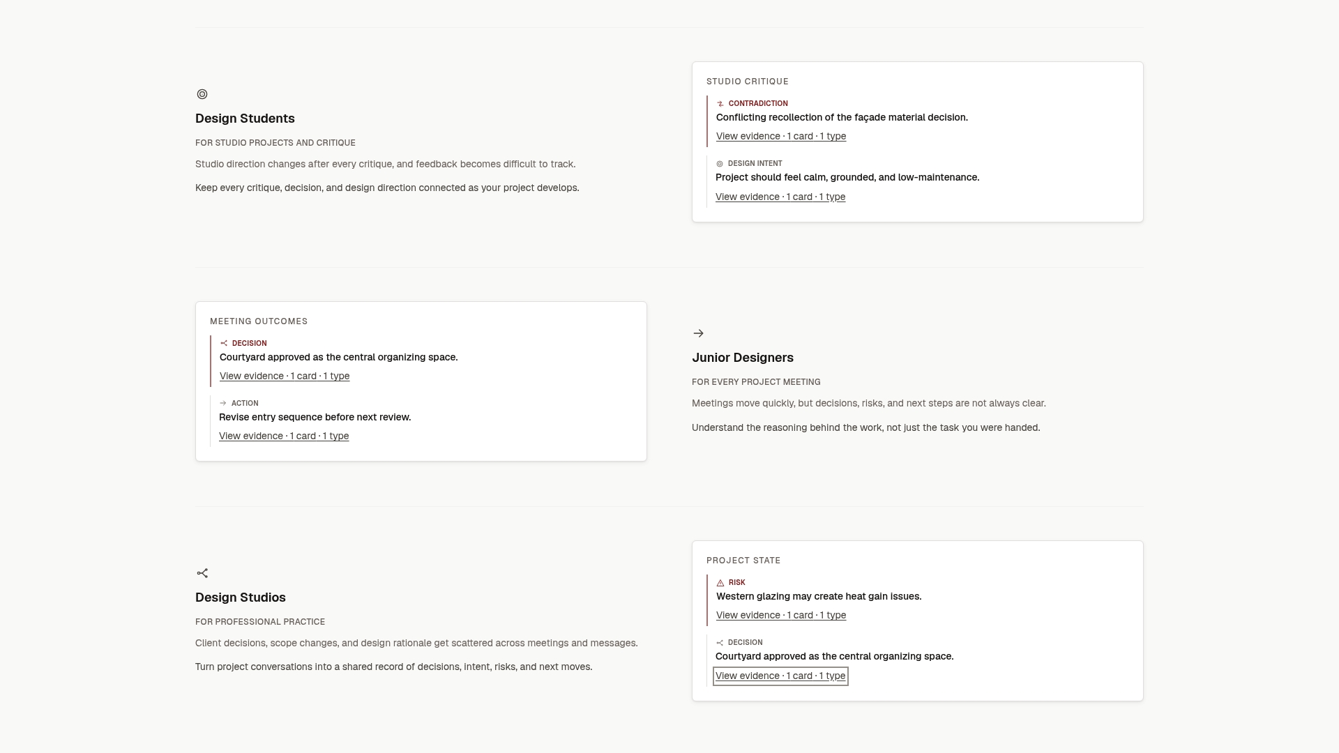
It’s built for architecture studios, design teams, freelance architects, and design students who need decision documentation that survives staff turnover and project handoffs without someone manually transcribing every crit session. If you’re evaluating whether it fits your workflow, check the pricing page and start a trial on your next project. Run it against a single sprint’s worth of decisions and see whether the record you get back is one you’d actually hand to a new hire.
Sources
For readers who want to go deeper on the frameworks and research behind this article:
- Design Rationale, Rationale Project (MIT/CSAIl)
- A survey of design rationale systems, Regli et al. (survey PDF)